Jerry Mander

par_mander_01
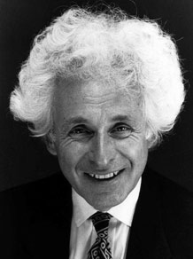
Since this is an article about gerrymandering, I thought I’d go with a clever, catchy title like Jerry Mander. Ha! But.. it turns out he is a real guy (pictured on the right) with real crazy hair and has written a book about the dangers of television. He also wrote a book about the flaws of capitalism. I get a sense he is just against things (including combs). This article is actually about the other kind of gerrymandering:

n. The practice of redrawing electoral districts to gain an electoral advantage for a political party.

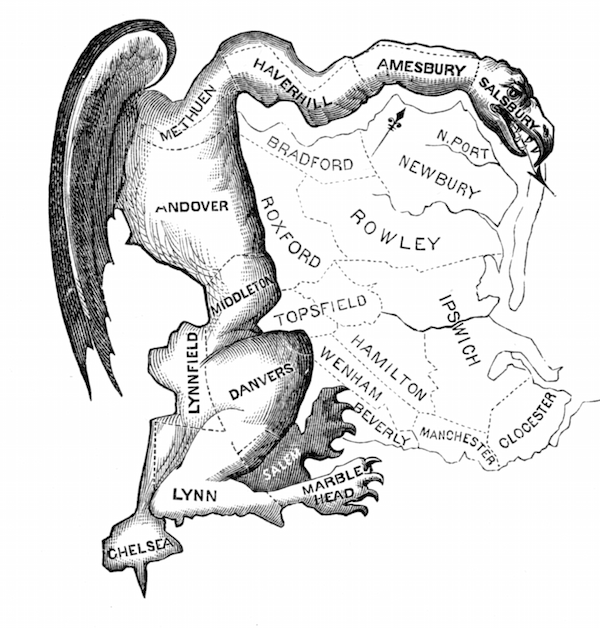
You can read all about gerrymandering online. Its not a new practice. The picture below was published when the term was first coined in 1812.

The_Gerry-Mander_Edit

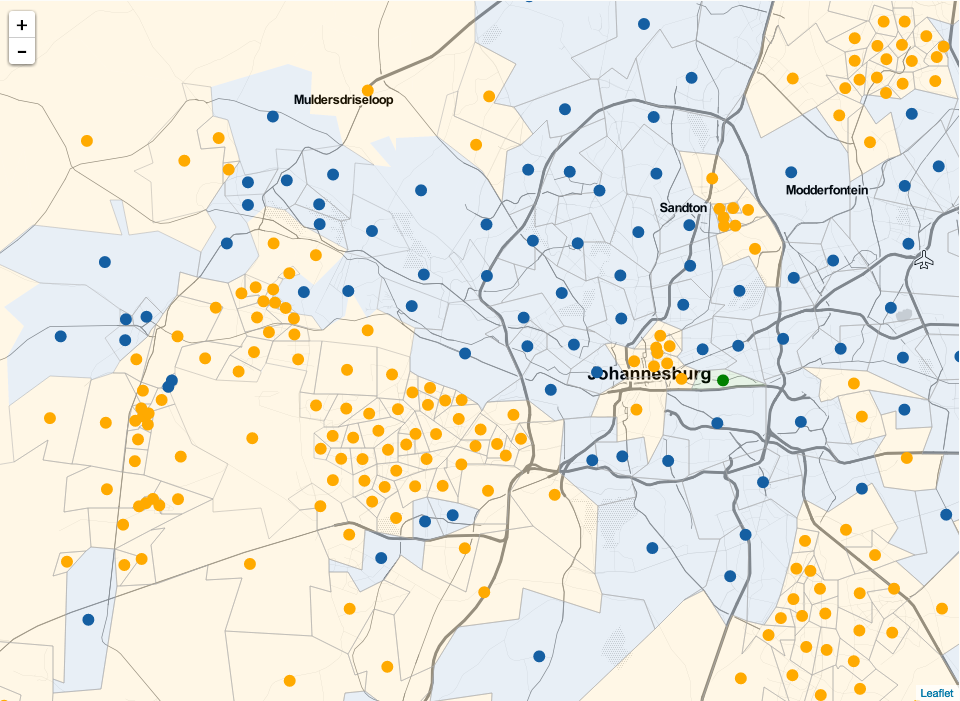
What I’m wanting to show here is how this relates to a South African context. With the next municipal elections coming up soon, its interesting to see how our electoral system implements the notion of voters vs. voting district. Continue reading “Jerry Mander”

Isochronic World Map

I love old timey world maps. Cartographers have understood the science of data visualisation for a long time and some of these old hand drawn maps are truly incredible works of art. This map shows the average travel time (in days) from central London to another part of the world. 10-20 days to get from London to South Africa. Its the journey, not the destination man! Plus there was probably more leg room. Thanks to @BrianPinnock for the original link.

Shazam’s huge São Tomé and Príncipe User Base

I had the pleasure of watching Cait O’Riordan speaking at last week’s Strata Hadoop in London. While she presented a fantastic talk, the one thing that struck me was a brief visualisation showing Shazam user activity around the world. Continue reading “Shazam’s huge São Tomé and Príncipe User Base”

Yet Another IP Attack Map

Screen Shot 2014-09-16 at 12.33.28 PMAttack maps are becoming a more common data visualisation with some great examples that have been doing the rounds here, here and here. I tackled a similar project that has been put on hold for now, but I really enjoyed making the map and I think its a fun interpretation. The version I put up shows the attack data for 1 May 2014.


Those Wacky Cartographers

In 1988 the Proclaimers unleashed the song I’m Gonna Be (500 miles) on an unsuspecting pub song singing audience. It quite likely the created the first song in the world that if you were caught not singing along to the chorus, you would be ejected from the pub and publicly shunned until it was your round.

That song did get me to think about what it would be like walking 1000 miles (500, and then 500 more). That’s about the distance from here to Cape Town, which is an uncomfortable flight or a very dull, tiring drive. Walking it would be madness. For the Proclaimers, who presumably started in Leith, walking 500 miles in any one direction poses a logistical problem. Enter the cartographers. The first map exploring this problem would have been how I would have looked at it too:

BoADpGpCEAEChTo Continue reading “Those Wacky Cartographers”