
This is what it looks like when you simulate pushing a bicycle and just let it fall over. 800 times. Continue reading “Two neurons are riding a bicycle”
Category: General
Really Old Data Visualisation Book
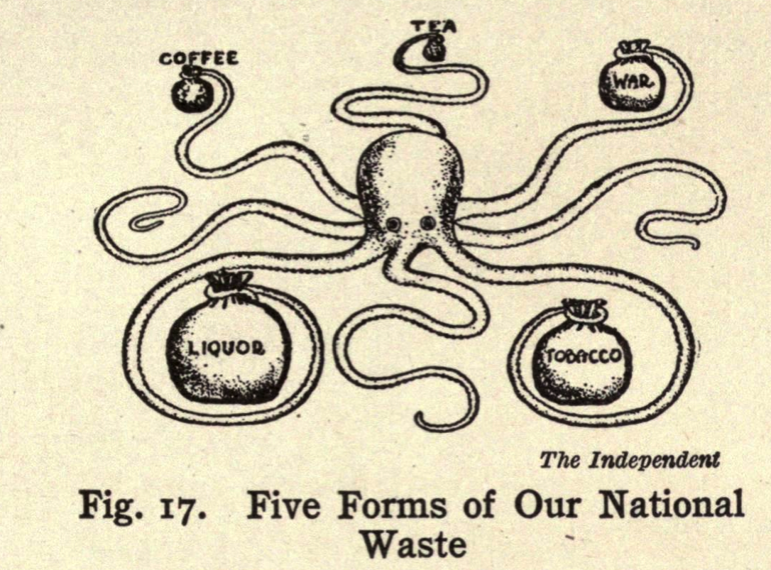
If you are into this sort of thing, Microsoft and the Internet Archive have digitised a copy of the 1919 epic Graphic Methods for Presenting Facts by Willard C. Brinton. While not one of the original seminal works, it still shows that the thinking that goes into basic information display is a lot older than we generally assume. And it has some very cool illustrations, which today would get you a post on viz.wtf.
The Wedding Photographer Problem

Jason posted yet another awesome edition of the Naked Data newsletter (which you should all definitely be reading). In this particular issue (#75) there is article entitled: Automatically generate beautiful visualisations from your data. Although there is a lot of snark in that title, the author is basically saying that good data visualisation is difficult and requires someone with training and experience if you want a decent end product. Continue reading “The Wedding Photographer Problem”
The Infographic Awakens
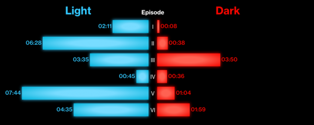
Since we are still in the grips of Star Wars frenzy (and the various problems in the world that need solving will still be there in tomorrow), Bloomberg created an infographic showing the use of the Force across all 7 Star Wars films. I like the adherence to the colour scheme and, since the data doesn’t actually matter, this if form over function that works well.
Colour Palettes for Data Visualizations
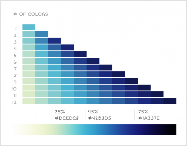
When creating a data visualisation, one the worst ways to encode the differences between values is to use changes in colour. Whether going from light to dark or changing between two colours, our brains are not particularly good at determining how big the difference is and for small differences, we may not notice it at all. Continue reading “Colour Palettes for Data Visualizations”
Isochronic World Map
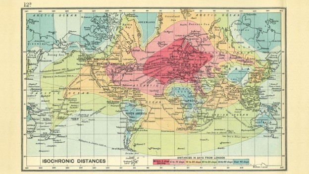
I love old timey world maps. Cartographers have understood the science of data visualisation for a long time and some of these old hand drawn maps are truly incredible works of art. This map shows the average travel time (in days) from central London to another part of the world. 10-20 days to get from London to South Africa. Its the journey, not the destination man! Plus there was probably more leg room. Thanks to @BrianPinnock for the original link.
Your Vote is Needed
The IIB awards have opened voting to the public. Since I’m on the shortlist, I figured I would make an impassioned plea to all 4 regular readers of this site to please cast a vote for me. Continue reading “Your Vote is Needed”
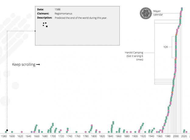
A Timeline of When the World Ended
A recent Naked Data newsletter pointed me to this article on wikipedia which gives a list of when the world was predicted to end throughout recorded history. Its a timeline of when the world was supposed to end, who claimed it would and how/why. It is wikipedia, so its as accurate and complete as wikipedia can be. I figured it would be a nice thing to see on an actual timeline, so here we have it. Continue reading “A Timeline of When the World Ended”
World Population Cartogram
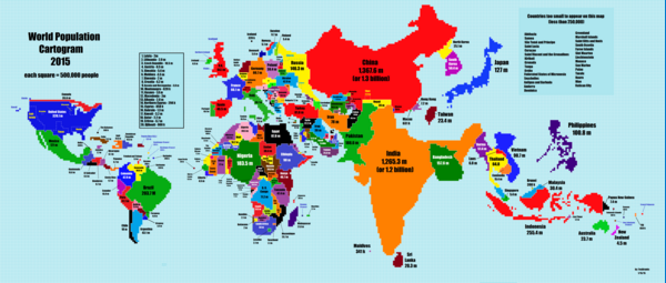
I love cartograms. Anything that reshapes how we view a map to add a different dimension for data is awesome! Here is one that shows where most of the world’s population really lives. Continue reading “World Population Cartogram”
Racial Make Up of Police Force vs Community
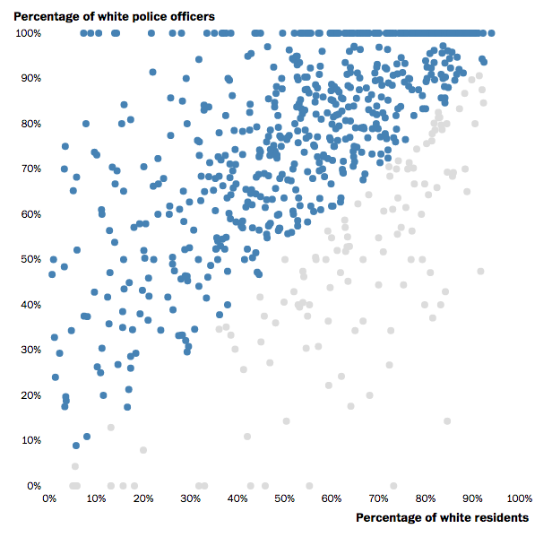
This post in the Washington Post is a great example of using an interactive scatter plot to show varying proportions. Interesting story too. Continue reading “Racial Make Up of Police Force vs Community”