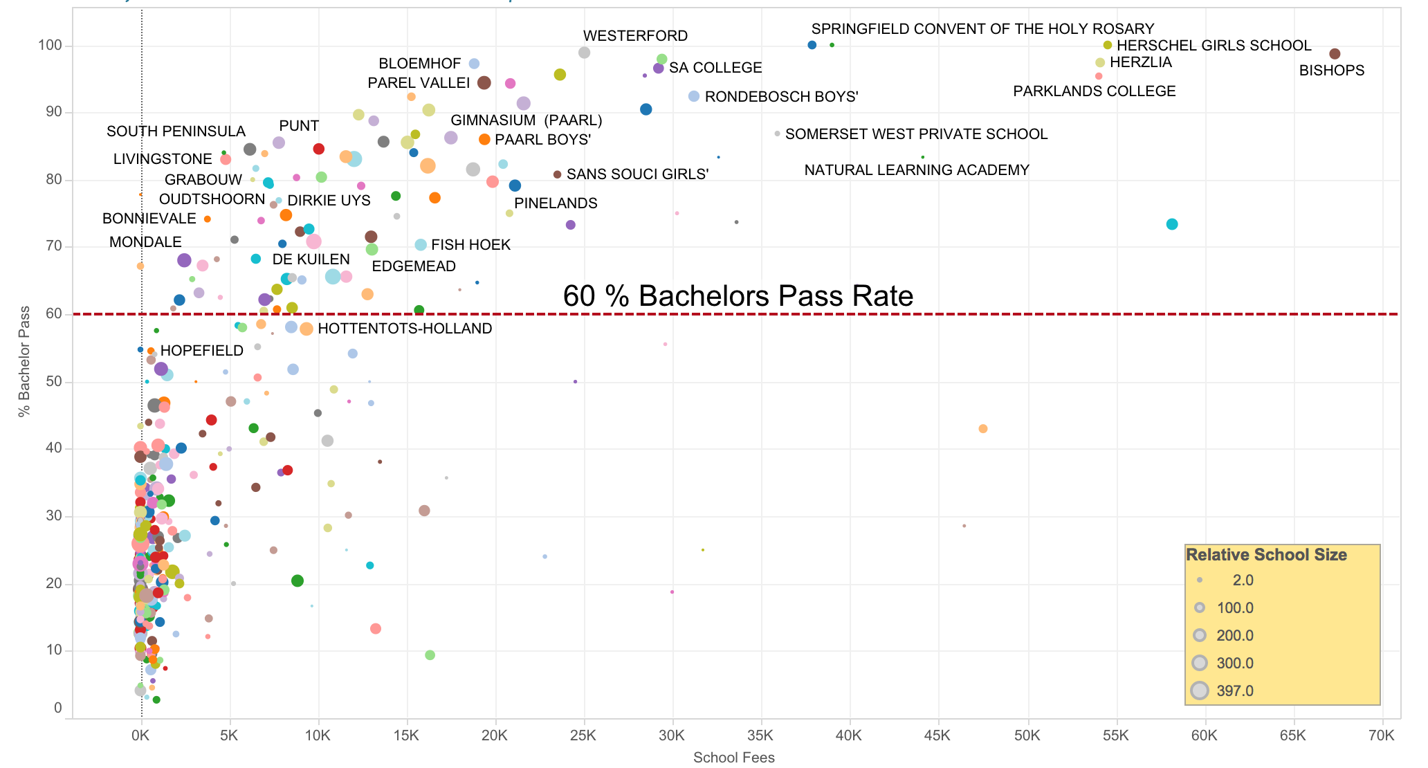
Guy Taylor sent me a link to a data visualisation that shows the bachelors pass rate for western cape schools. I quite like the intention and the implementation. Plus I guess I will have to re-install tableau public to look at the data.
Data Visualization
Guy Taylor sent me a link to a data visualisation that shows the bachelors pass rate for western cape schools. I quite like the intention and the implementation. Plus I guess I will have to re-install tableau public to look at the data.
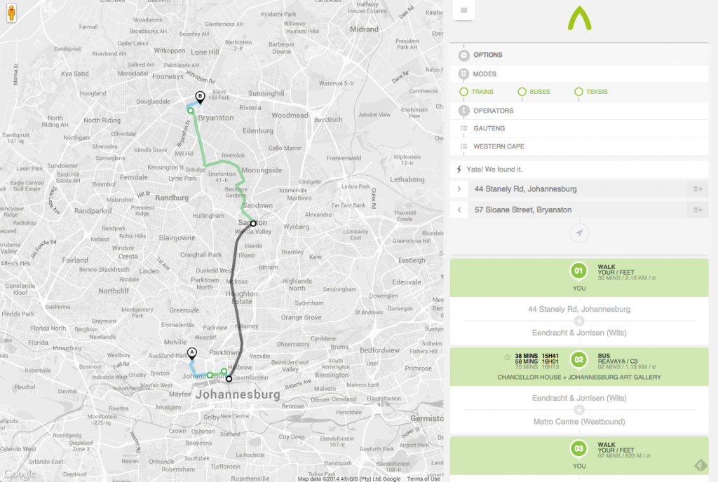
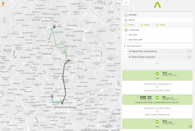
A way to be is a great start at mapping the transport systems in South Africa that remain unmapped and off the web. Adding Taxis onto Google Maps is a fantastic achievement and we can but hope more transport providers add their data to it.
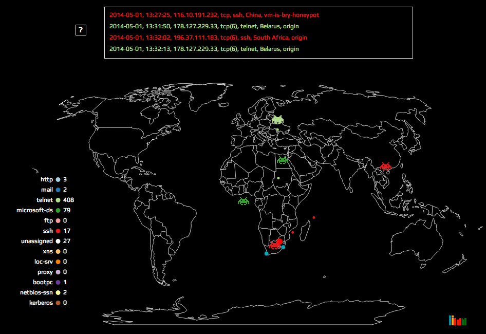 Attack maps are becoming a more common data visualisation with some great examples that have been doing the rounds here, here and here. I tackled a similar project that has been put on hold for now, but I really enjoyed making the map and I think its a fun interpretation. The version I put up shows the attack data for 1 May 2014.
One of the projects I worked on in 2013 gave me access to a large list of South African ID numbers. Since the South African ID number encodes the person’s birthdate into the first 6 digits, I realised it would be possible to make a South African version of this map of common birthdays in the US. I grabbed digits 3 – 6 (month and day) of each ID and discarded the rest to be safe. From there, its was simple enough calculate the frequency distribution. The US map only shows the ranking, not the actual distribution and so I have made an interactive version that does both:
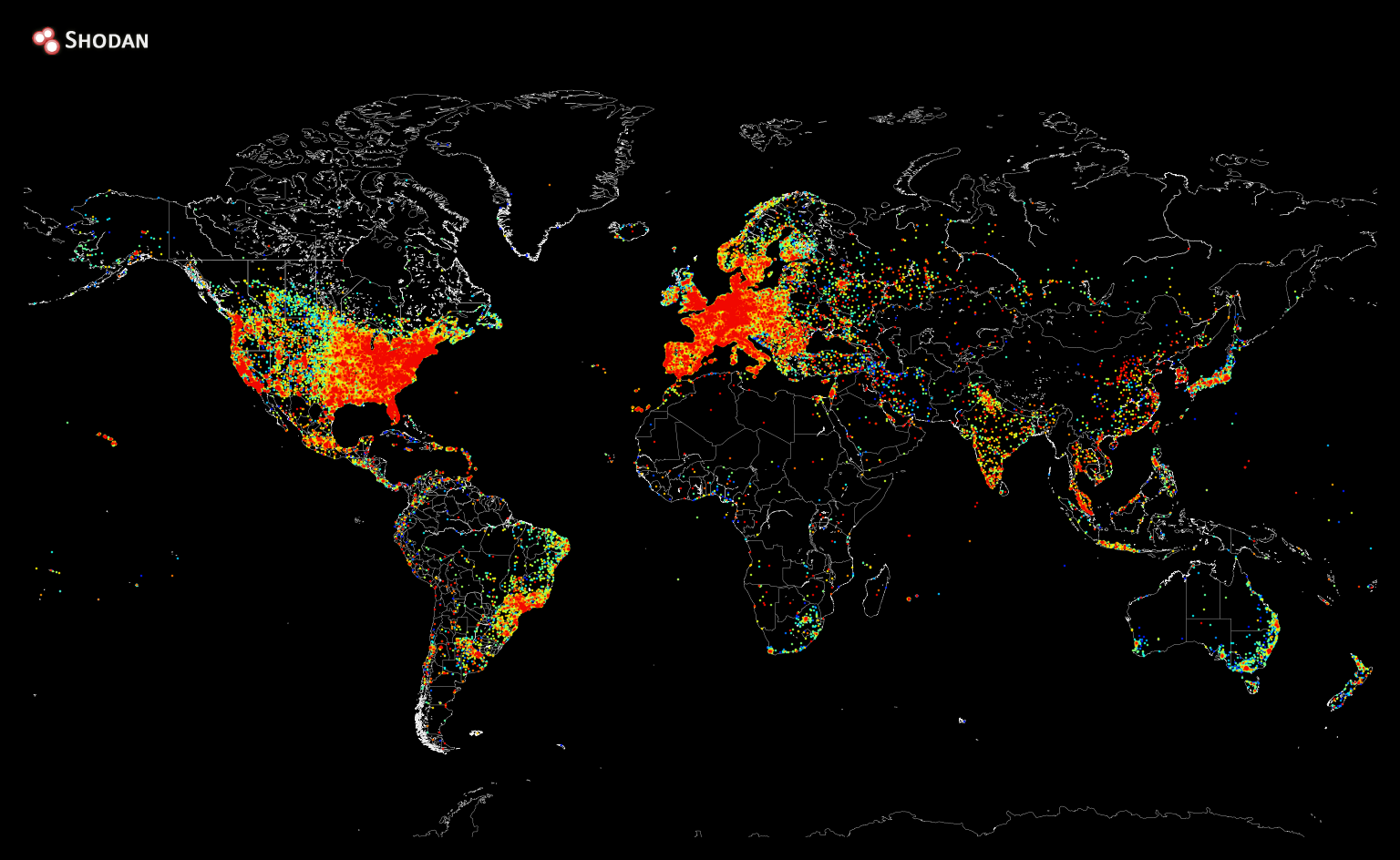
Shodan recently created a heat map of all the devices connected to the internet. Sadly Africa still has a long way to go 🙁
One of the key attributes of good data visualisation is that it tells a story. The pictures can bring a narrative to life in what would otherwise be lost if you are just looking at numbers. This post from Sift Science is a great example of that:
http://blog.siftscience.com/seven-habits-of-highly-fraudulent-users/
![]()
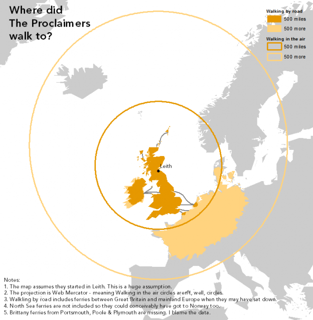
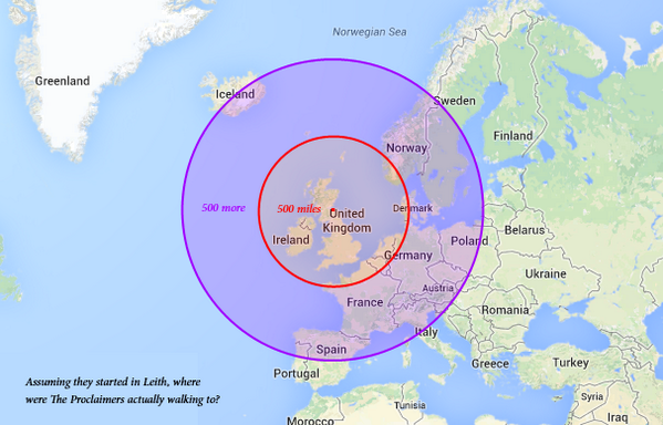
In 1988 the Proclaimers unleashed the song I’m Gonna Be (500 miles) on an unsuspecting pub song singing audience. It quite likely the created the first song in the world that if you were caught not singing along to the chorus, you would be ejected from the pub and publicly shunned until it was your round.
That song did get me to think about what it would be like walking 1000 miles (500, and then 500 more). That’s about the distance from here to Cape Town, which is an uncomfortable flight or a very dull, tiring drive. Walking it would be madness. For the Proclaimers, who presumably started in Leith, walking 500 miles in any one direction poses a logistical problem. Enter the cartographers. The first map exploring this problem would have been how I would have looked at it too:
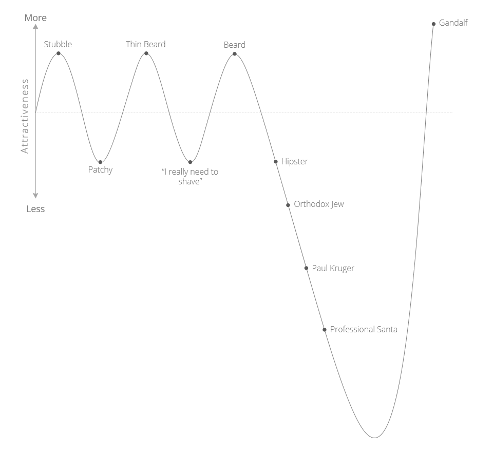
On one of my recent internet wanderings, I came across a very awesome Beard Attractiveness Graph. It needed some design TLC and localising for a South African audience, so here is the do-over.
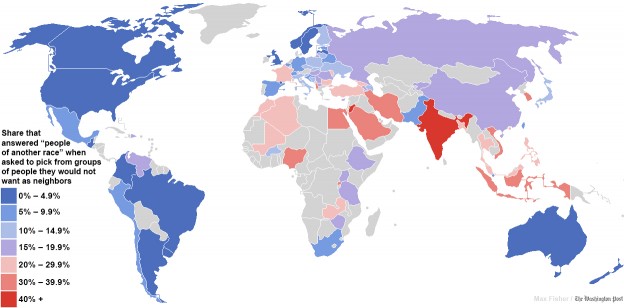
The Daily Mail link baited an article originally published in the Washington Post about the world most racists countries and they produced this map:

The data for this comes from the World Values Survey, and is clear indicator of what should be an internet law (something like Godwin’s Law or Poe’s Law) that states:
“Just because the data is attached to a pretty infographic (or map or graph), does not make it true”
Needless to say this caused a big brouhaha and the Washington Post did an update saying that the results could be interpreted differently. Plus of course the originally published data had some massive errors. But it was too late, the map is out and people have made up their minds and moved on.
I know I’m late in posting this and in Internet terms its not just old news, its not news, but it is nice to show off something that puts South Africa in a positive light. Well, something that shows that survey respondents from South Africa decided to say the right thing.
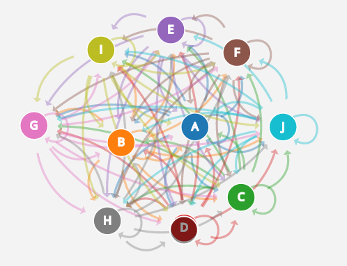
This is an amazing visual explanation of Markov Chains, built using D3. I really like the way the playground works. It lets you generate your own chains and watch as the complexity increases as you add more states.
To be fair though, I tend to enjoying watching D3 rendering algorithms generally. Its cheaper than satellite TV and works on my phone too 🙂
Thank you to Brian for the link.