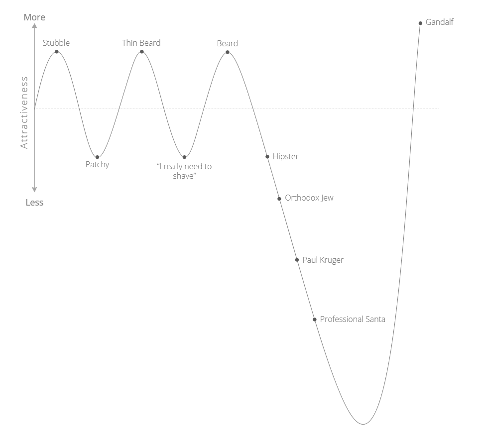
On one of my recent internet wanderings, I came across a very awesome Beard Attractiveness Graph. It needed some design TLC and localising for a South African audience, so here is the do-over.
Data Visualization
On one of my recent internet wanderings, I came across a very awesome Beard Attractiveness Graph. It needed some design TLC and localising for a South African audience, so here is the do-over.
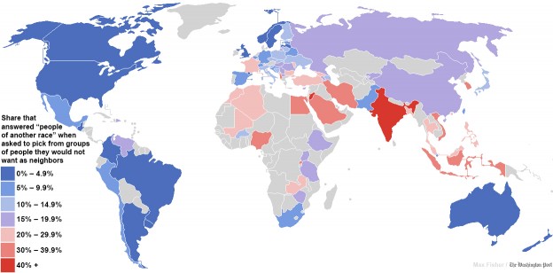
The Daily Mail link baited an article originally published in the Washington Post about the world most racists countries and they produced this map:

The data for this comes from the World Values Survey, and is clear indicator of what should be an internet law (something like Godwin’s Law or Poe’s Law) that states:
“Just because the data is attached to a pretty infographic (or map or graph), does not make it true”
Needless to say this caused a big brouhaha and the Washington Post did an update saying that the results could be interpreted differently. Plus of course the originally published data had some massive errors. But it was too late, the map is out and people have made up their minds and moved on.
I know I’m late in posting this and in Internet terms its not just old news, its not news, but it is nice to show off something that puts South Africa in a positive light. Well, something that shows that survey respondents from South Africa decided to say the right thing.
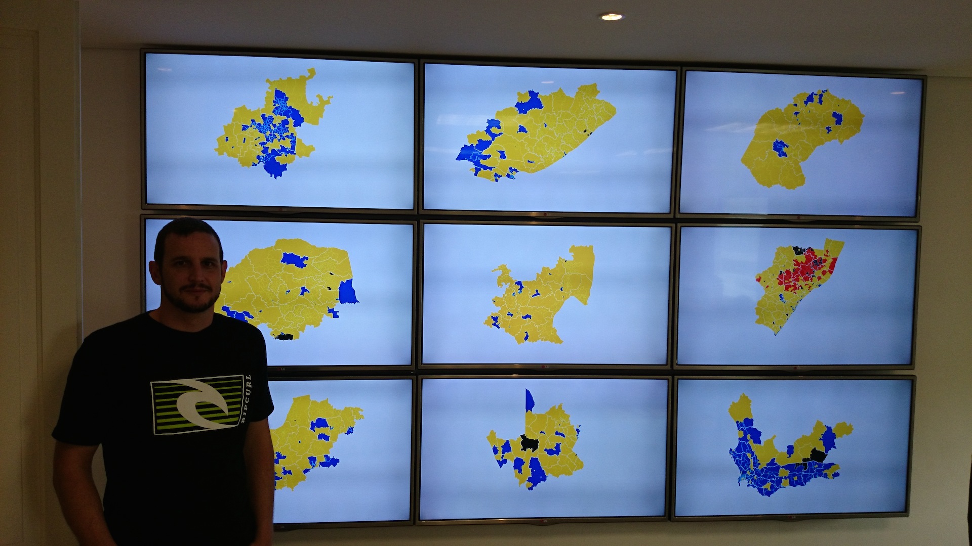
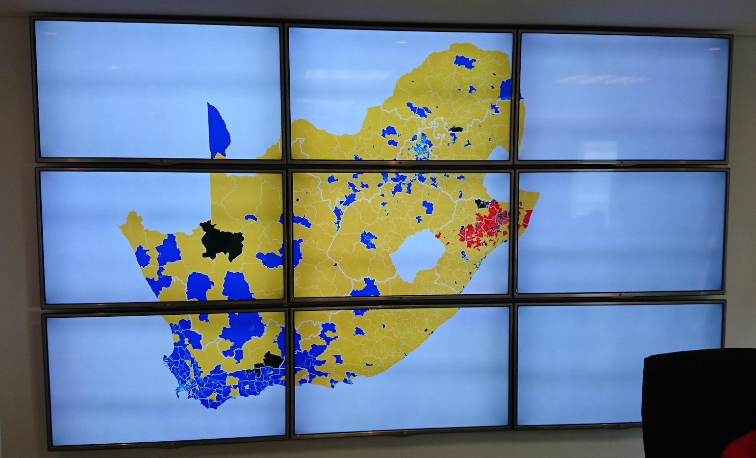
May was an interesting and fun month. I finished a project to build a big 3 x 3 TV wall display to be used at a call centre for the 2014 elections. The requirement was to have 9 screens all operating independently that can have individual images sent to each screen or a single image zoomed across all 9 screens.
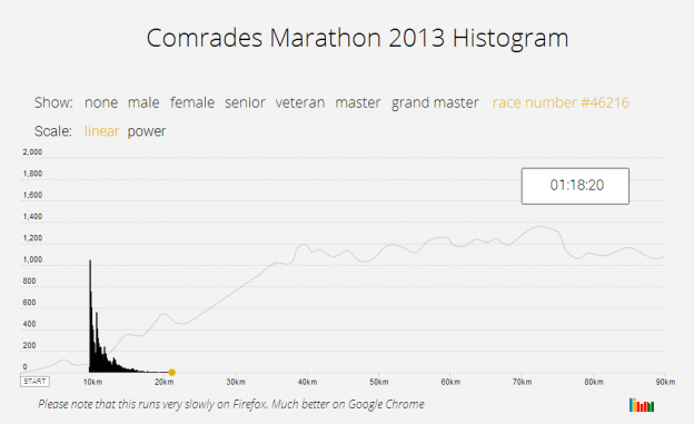
 I do occasional Park Runs and trail runs. On a recent run I started to wonder what the distribution or histogram of runners looks like. It would be a big moving blob at the start that slowly thins out as the faster runners pull away from the slower runners. The shape will depend on the race distance and the number of runners. I first did it for the Comrades Marathon in 2014, and now again for the JP Morgan Corporate Challenge. The shape will depend on the race distance and the number of runners. Continue reading “Mapping Runners”
Plotting the flight paths of airplane traffic seems to be a new branch of data visualisation on its own. The most recent video doing the rounds is this one:
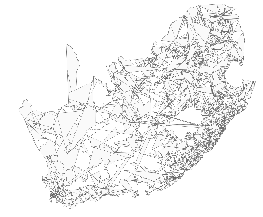
Mike Bostok has a fantastic tutorial on how to make a map using d3 and topojson. Having done some mapping work recently for a client, I was keen to learn more and try do a d3 based cartogram. I found some good examples of non-contiguous cartograms, but I wanted to make a South African version of a contiguous one using Shawn Allen’s d3 implementation.
Here is the final product, and I’ll take you through some of the tricky parts that I had to deal with.
While working on making a d3 based cartogram, I accidentally made a new map of South Africa. I dig it!
Google publishes a transparency report that shows how many removal requests or user data requests have come from each country. South Africa has not had much activity here, but I wonder how this would change once / if the secrecy bill goes through.
| Reason | Court Orders | % Complied With | Items Requested |
| Defamation | 6 | 66.7% | 19 |
Total Removal Requests
![]()
Building the Census Data Explorer required that I have the South African Census data in a format that worked easily with D3, i.e. JSON. I therefore had to get the data from the Statistics South Africa website and convert it into JSON format. I’m making it available here for you to use. Its not complete, just the data I needed for this project.

Updated: 23 Oct 2013
Most of my projects have been implemented using the D3 libraries and the D3 mapping components use GeoJSON and TopoJSON. When building the Census Explorer, I needed a provincial map of South Africa in GeoJSON format. Google didn’t know where to find any so I had to make one.