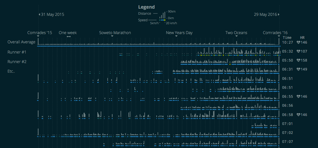
On a recent job at Discovery to do some analytics for Vitality, I was looking at data that is recorded into their platform as part of their insurance linked wellness program. There are various activities that are tracked as part of the program and a fair amount of it is running data. Given the size of their customer base it’s fair to assume that many of them have run the Comrades Marathon, and I wanted to see what all those runner’s various training programs looked like. Continue reading “One Year of Comrades Training”
Category: South Africa
Misery Index
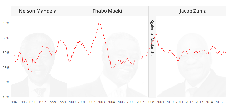
There have been a couple of articles recently that have spoken about South Africa having a bad Misery Index rating. Its quite a harsh term, but ennui index or “not cool man” index isn’t going to grab headlines. Like a lot of statistics reported in popular media, it tends to be reported as a snap snot number at a particular time rather than the trend. So here is a historic plot that shows how miserable we have been since 1994. Continue reading “Misery Index”
Jerry Mander
 Since this is an article about gerrymandering, I thought I’d go with a clever, catchy title like Jerry Mander. Ha! But.. it turns out he is a real guy (pictured on the right) with real crazy hair and has written a book about the dangers of television. He also wrote a book about the flaws of capitalism. I get a sense he is just against things (including combs). This article is actually about the other kind of gerrymandering:
n. The practice of redrawing electoral districts to gain an electoral advantage for a political party.
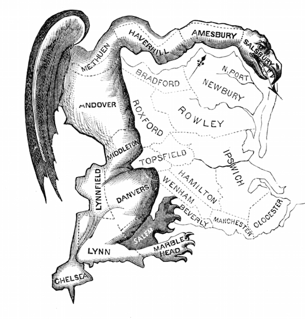
You can read all about gerrymandering online. Its not a new practice. The picture below was published when the term was first coined in 1812.
What I’m wanting to show here is how this relates to a South African context. With the next municipal elections coming up soon, its interesting to see how our electoral system implements the notion of voters vs. voting district. Continue reading “Jerry Mander”
IIB Shortlist
I made it. Look out WSJ and Economist. Continue reading “IIB Shortlist”
Mapping Marriages
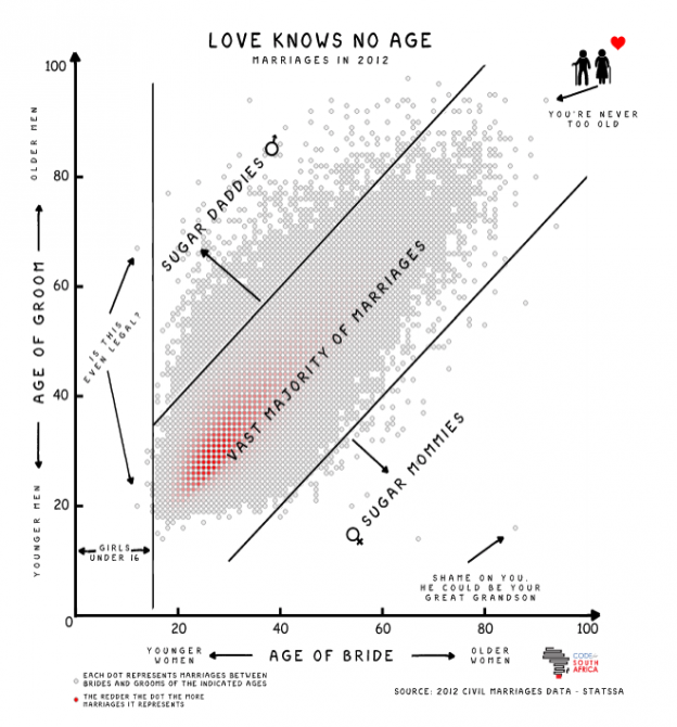
The very talented Adi Eyal created a scatter plot that shows the age distribution between men and woman when they get married. There is a big blob in the middle where the ages are similar and things get sparse towards the outlier sugar mommies and sugar daddies. Continue reading “Mapping Marriages”
Microsoft’s Big Data Art Exhibition

Microsoft have an art exhibit at Sandton City at the moment, running until 3 July, to try make big data more interesting without actually using any data. Like many art exhibits, its head scratchy stuff (or beard-strokey, if you have one) and you really have to stretch quite hard to see the relevance. In the context of what they were doing, I am disappointed in the execution of the art itself. While the exhibit is about Big Data and the art pieces have explanations relating to Big Data, it does not mean that they works automatically convey anything meaningful about the topic. Remember, coloration does not equal causation. Continue reading “Microsoft’s Big Data Art Exhibition”
South Africa’s Expensive Fuel Costs
This infographic from Statista pastes a grim picture of fuel costs in South Africa. It shows that over 5% of the average South African’s salary/wages goes to fuel costs. I’m not convinced about the validity of this presentation though. The source data may be correct, but it paints a picture of expensive fuel. South Africa does not have the most expensive fuel in world, in fact its about average. This simply raises more questions. How much fuel do we buy? Do we buy a lot more than other countries? Who is buying the fuel? Does this include what you pay for riding in a taxi or on a bus? Can you separate those who own cars and therefore pay for fuel out from the list?

A Way To Be
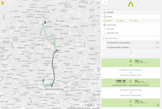
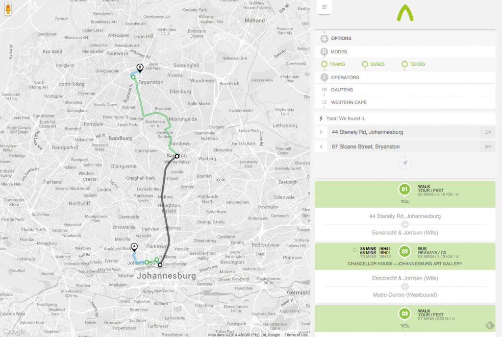
A way to be is a great start at mapping the transport systems in South Africa that remain unmapped and off the web. Adding Taxis onto Google Maps is a fantastic achievement and we can but hope more transport providers add their data to it.
Birthday Graph for South Africa
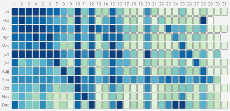
One of the projects I worked on in 2013 gave me access to a large list of South African ID numbers. Since the South African ID number encodes the person’s birthdate into the first 6 digits, I realised it would be possible to make a South African version of this map of common birthdays in the US. I grabbed digits 3 – 6 (month and day) of each ID and discarded the rest to be safe. From there, its was simple enough calculate the frequency distribution. The US map only shows the ranking, not the actual distribution and so I have made an interactive version that does both:
Internet Devices Map
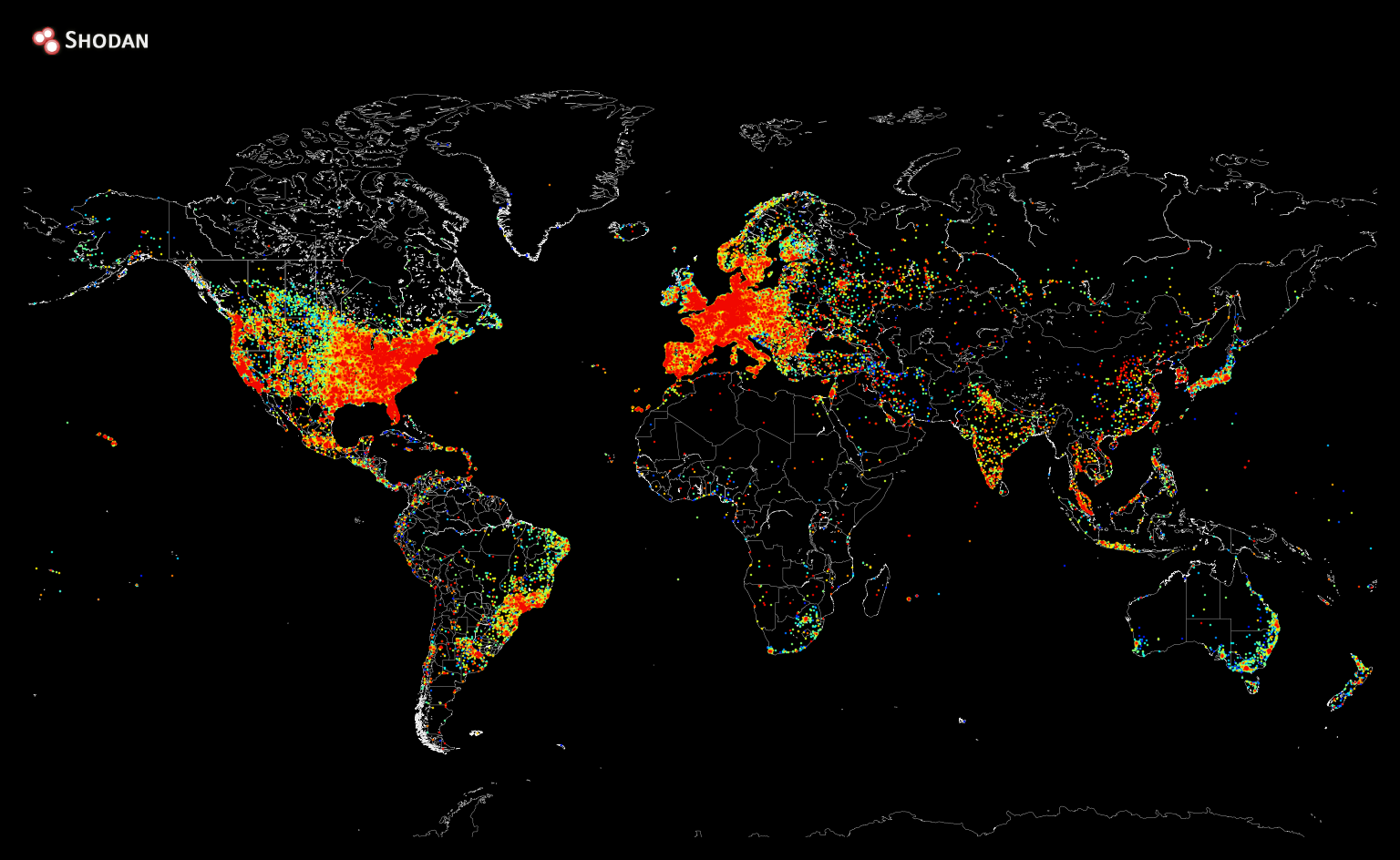
Shodan recently created a heat map of all the devices connected to the internet. Sadly Africa still has a long way to go 🙁