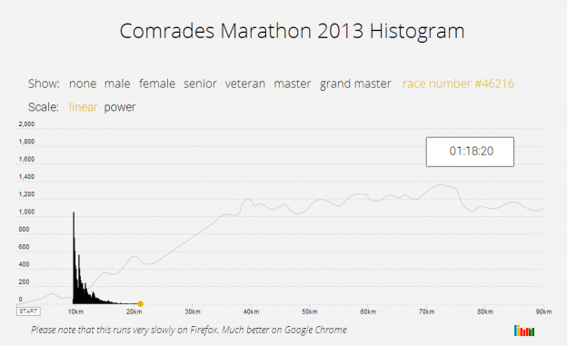
 I do occasional Park Runs and trail runs. On a recent run I started to wonder what the distribution or histogram of runners looks like. It would be a big moving blob at the start that slowly thins out as the faster runners pull away from the slower runners. The shape will depend on the race distance and the number of runners. I first did it for the Comrades Marathon in 2014, and now again for the JP Morgan Corporate Challenge. The shape will depend on the race distance and the number of runners. Continue reading “Mapping Runners”
Month: January 2014
Head of Geography
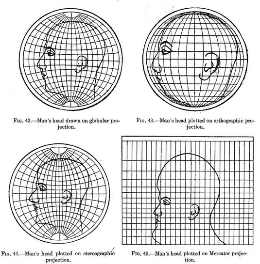
An image has been doing the rounds that shows the distortions introduced when reducing a 3D earth to a 2D representation. Like all those huge maps we used to have on our walls with pins in them to show where you’ve travelled. The drawings used in the original work show the distortions as applied to a human head, something we are familiar with.
Air Traffic Worldwide
Plotting the flight paths of airplane traffic seems to be a new branch of data visualisation on its own. The most recent video doing the rounds is this one: